
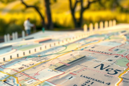
A washed-out screen at noon or a blinding white interface at midnight ruins even the best gps navigation for car hardware. After logging over 40,000 km testing navigation rigs across desert highways and dense urban canyons, I know that hardware nits mean nothing if your software profiles fail. Customizing map color schemes is your first line of defense against optical fatigue and spatial disorientation. Dialing in the right contrast values keeps your eyes focused on the asphalt instead of squinting at poorly rendered vector lines.
Why customizing map color schemes solves daytime glare
Direct sun hitting your windshield produces up to 100,000 lux of ambient light. This harsh illumination overwhelms standard transmissive LCD panels, causing immediate glare washout across your secondary roads and POI markers. Factory defaults often use pale grays and muted yellows that vanish instantly under direct sunlight. You must force the user interface to render high-contrast borders around routing vectors.
Set high-contrast daytime contrast settings with saturated cobalt blue or vivid magenta for your active track. Pure white backgrounds should be swapped for high-reflectance light slate gray to cut internal panel backscattering. Push your primary route stroke width to at least 4 pixels. This modification ensures immediate optical acquisition in less than 0.5 seconds, keeping your attention planted firmly on the road ahead.
Customizing map color schemes to eliminate night blindness
Nighttime driving demands complete preservation of your scotopic vision. Standard daylight maps blast your retinas with uncalibrated blue light wavelengths, destroying your dark adaptation for up to 10 minutes. A dedicated night navigation palette must replace blue and harsh white elements with deep amber, muted dark olive, and charcoal layers.
Keep background terrain elements mapped strictly between 5% and 8% black-point luminance. Set your active navigation line to a deep burnt-orange or dark crimson hue. This maintains enough separation from base map geography without triggering pupil constriction. Proper ambient light sensor calibration ensures smooth luminance shifts when transitioning through long tunnels, preventing sudden optic shock.
Hardware rendering pipelines and latency lag
Vector styling directly impacts the hardware graphics processing pipeline. Overly complex custom style sheets containing multiple gradient fills and heavy terrain shading introduce severe latency lag on older embedded processors. When your processor drops below 15 frames per second, screen updates stutter right at critical high-speed interchanges.
Optimizing map layers for clean frame rates
Strip unnecessary 3D building models, dense typographic labels, and heavy topographical contour layers from your active profile. Clean 2D flat rendering relieves the rendering engine, ensuring your position marker moves smoothly in lockstep with raw satellite telemetry. If signal triangulation drops out during urban canyon transit, your device relies on dead reckoning sensors like internal gyroscopes and accelerometers. Smooth vector drawing guarantees the dead reckoning engine projects your simulated trajectory onto the customized roadway without display hitching.
Touchscreen interface stability and capacitive ghosting
Thermal loads spike heavily when mounting any navigation unit directly behind windshield glass. Surface temps on an unshaded dashboard easily exceed 65°C during midsummer runs. Extreme heat alters the electrical characteristics of the digitizer matrix, frequently triggering capacitive ghosting across your custom map layouts.
When erratic phantom touches start shifting zoom levels or panning map centers off-target, high-contrast, uncluttered custom themes save the run. Keep your primary interface buttons enlarged and separated by at least 15mm of dead space. A high-contrast GPS display theme allows you to immediately detect whether the unit is tracking your actual coordinate or drifting due to an accidental screen registration.
Route calculation dynamics and preventing rerouting loops
Color choices directly govern how rapidly your brain decodes complex interchange options. When navigating through complex highway bifurcations, muted secondary routes cause visual confusion that leads to missed turnoffs. You then force the firmware into rapid calculation cycles, risking severe memory thrashing.
Configure your secondary and alternate tracks with low-visibility charcoal tones while leaving the calculated trajectory blazing in pure hyper-contrasting tones. Clear color hierarchies aid in preventing rerouting loops by removing route ambiguity before you commit to an exit ramp. The best gps for car setups prioritize route legibility above visual eye candy every single time.
Field deployment checklist for map palettes
Never take factory visualization settings for granted when deploying hardware into the field. Before starting your next multi-thousand-kilometer haul, pull your rig up under direct midday sun and lock in your high-visibility daytime profiles. Then re-test the unit at 02:00 hours on an unlit backroad to confirm your night profiles don't degrade your forward vision. Commit to customizing map color schemes across all your field hardware to maximize operational clarity, reduce eye strain, and protect your vehicle on every run.